How Websites Use 'Dark Patterns' to Trick You Online

man with credit card on computer
If you're not careful you can find yourself paying for items you hadn't planned on, thanks to dark patterns online. boonchai wedmakawand/Getty Images

You're just about to check out with your online purchases when you realize that some item — perhaps an accessory, insurance or an extended warranty — has been slipped into your shopping cart. Turns out, you had to uncheck a specific box to dodge these sneaky charges.

You were lucky enough to spot this bit of trickery. However, inattentive or rushed buyers might totally miss the extra charge.

Advertisement

And that's exactly the idea.

This is just one example of what's called "dark pattern web design." These are user interfaces and website designs meant to trick you into doing something you didn't really mean to do, such as spend more money, share personal data or subscribe to an annoying newsletter that you really don't want.

Often, you'll find these dark patterns on shopping sites. And the more popular the site, the more likely it is that the site's designers use a dark pattern of one type or another, according to a 2019 Princeton University study.

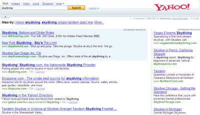
Case in point: Google recently altered the way search results appear. The idea is to make it harder for users to figure out what's an ad and what is a legitimate source of information. And every time you accidentally click an ad? Google makes more money.

Social media? Packed with dark patterns. Want to delete your Facebook account? The company makes the process convoluted and sometimes even guilts you into changing your mind, saying your friends will "miss you."

The Princeton study analyzed about 11,000 shopping websites. Of those sites, 1,254 (around 11 percent) deployed dark patterns to trick visitors. Researchers pinpointed 15 common techniques that qualified as dark patterns.

The tactics differed from site to site. Some deployed "sneaking" (for instance, not presenting extra fees until just before you paid) or false urgency (like a sale countdown clock) to rush you into buying. Others relied on social proof ("this product has five stars!") or "pressured selling" (pre-selecting the more expensive version of the product). But all of these techniques are meant cajole, manipulate or outright deceive you, taking advantage of our tendency to blow past details online as we click, surf and buy with wild abandon.

Advertisement
The Dark Pattern Fighter

The term "dark pattern" was coined by Harry Brignull in 2010. He's an online user experience professional who helped launch DarkPatterns.org, a site devoted to educating internet users about dark patterns — and shaming companies that use them. Brignull also has a doctorate in cognitive psychology, and as he's witnessed, people who create dark patterns are really, really good at understanding the way humans interact with online graphical interfaces and textual cues.

He compares dark patterns to IKEA home furnishing stores. If you've never been to an IKEA, know that they aren't laid out like many other superstores that feature huge, open spaces and long straight aisles. Instead, IKEA builds small, narrow, twisting aisles that turn your shopping experience into an expedition. Along the way, you're exposed to a whole lot of products other than the one you originally set out to buy — and that's by design. IKEA wants you pick up more items on your journey, and hopefully, spend more money.

Advertisement

"In the digital world it's much easier to design mazes and corridors. It doesn't cost anything to add 10 steps to a checkout process," Brignull says in an email interview. "It doesn't cost anything to test 100 different versions of the checkout experience on a hundred thousand people to find out scientifically which one performs best."

But with dark patterns, he says, websites purposely skip subtle manipulation and go into blatant deception.

The next thing you know, you've signed up for a marketing newsletter that you didn't want. Or purchased travel insurance that you didn't need or unknowingly made a charity donation — just because you didn't uncheck a box (or boxes) the company had pre-selected for you.

Brignull says that he first started seeing problems like these around 2009. "I kept noticing these instances of bad design that didn't seem like mistakes," he says. "I kept finding things that were annoying or frustrating, but seemed to be designed on purpose, to benefit the company doing it."

So, he started DarkPatterns.org to spread the news about these practices. He hopes that by shedding light on this grubby form of digital profiteering, users will become smarter and companies will be less inclined to use them.

"Commercial organizations are motivated by growth and money," he says. "Talk about ethics is just talk. What we need is regulation. If we can regulate the financial industry and the health care industry well, we can do the same for other industries."

It seemed a step in the right direction when in May 2018, the European Union passed the General Data Protection Regulation (GDPR), legislation meant to improve consumer protection and privacy. The idea is that websites must provide very clear notifications that allow users to opt out of surveillance and cookie tracking.

The result? Not only are companies not following the law, they're actively crafting notifications to deceive people into accepting surveillance instead of rejecting it.

That's because no one is enforcing the law, according to Politico.

Sans fines or sanctions of any kind, companies seem likely to continue their bad behavior. In the meantime, U.S. legislators are still debating how to build privacy laws that will really work.

Until better laws and enforcement are in place, pay close attention to dark patterns on websites so you won't get caught.

Advertisement

Frequently Answered Questions

What are dark patterns?
Dark patterns are user interface design patterns that trick users into taking an action they might not otherwise take. Dark patterns are often used to convince users to sign up for something, make a purchase, or click on an ad.
What is dark pattern on social media?
There is no definitive answer to this question, but one possible interpretation is that dark pattern refers to any type of social media activity that is designed to manipulate users into doing something that they might not otherwise do. This could include things like creating false urgency around a sale, or using fear-mongering tactics to get people to share a piece of content.

Advertisement

Loading...