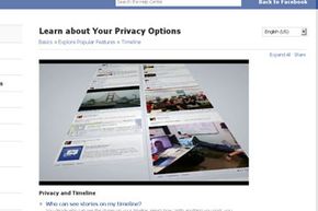
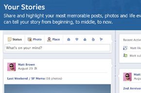
Before you start eating a fancy meal, you snap a photo of it and upload it to Facebook. Your whereabouts are never, ever a mystery to your friends, thanks to Facebook's Check In button. You carefully organize your Facebook photo albums so memories are easy to find. In short, your life is an open (Face)book. But recently, everything changed -- you probably even posted about it. Facebook rolled out their new Timeline layout for users' personal pages.
When using your Facebook account, there are two basic options for what you're looking at: Either your personal page, or your news feed. Your personal page, which used to focus on your statuses, actions and pictures, once worked a bit like a blog: The most recent events were positioned at the top of the page, and older posts came after. It was static, and didn't change -- unlike the News Feed you probably see when you first log in, which is a dynamic, changing collection of clips from your friends' walls.
Advertisement
Beginning in January 2012, the service transitioned to something called Facebook Timeline, which presents that information in a more scattered, curated format. Think of it as an online magazine, focused on you, which attempts to "tell the story of your life" by clustering pictures, posts and comments from various Applications to provide snapshots of what you are, or were, doing at any given point in time.
While the service was described at first as optional -- Facebook prompted users to move to the new format if and when they felt comfortable -- it was only a few weeks before rumors that the Timeline would be become mandatory began to spread. As with any change in Facebook's services -- whether in layout, terms of service or privacy settings -- the uproar was immediate. While much of this resistance was simply discomfort at the idea of once again changing what the site looks like and how we use it, there were some legitimate concerns.
Advertisement


